⁉️

I redesigned and rebranded the public website for Washington Energy Facility Site Evaluation Council, which is a state level branch of a federal department that oversees privately run energy production facilities from siting and surveying pre-construction, through decommissioning at end of life. The process is complex, often spanning many years and at the scrutiny of the public who live in the communities near which prospective sites are being considered. While the public had long been complaining that it was too hard to find information on the old website, the internal staff also had trouble managing it.
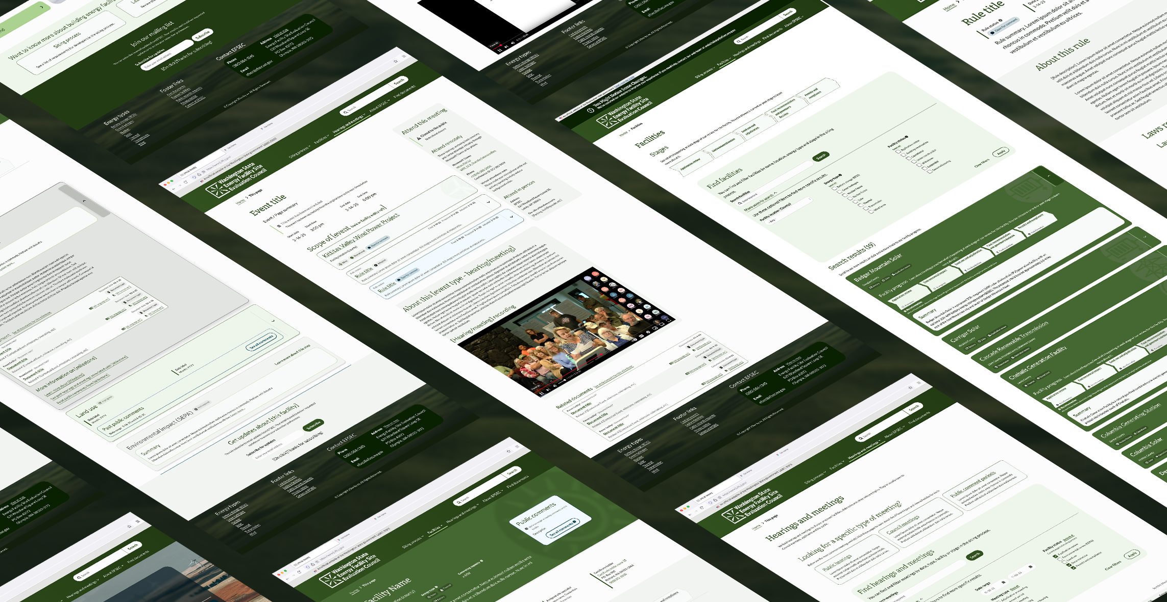
I collaborated closely with an expert content strategist to develop a new OOUX framework for EFSEC to use to conceive of the various steps and stages of the siting process. My UX concept for the improved site would attend to the majority of users needs and the effort would build goodwill with the communities that often felt unseen by the agency because they were unable to meaningfully engage. I created a deep library of visual styles and design system to support the complex workflow and to keep the content accessible to low-information and experienced users alike, as well as meeting a11y standards.
This process began with leading multiple workshops and focus groups for branding and identity, design thinking and solutioning as well as prioritization when our good ideas fell out of scope with the limited time and financial constraints (to be revisited in the next fiscal period).

Developing identities for government agencies is one of the trickiest sectors I’ve worked in, where the public’s expectations and desires are often at odds with the internal stakeholders’ preferences, and the public usually wins. With a history of trade-offs I was pleased to be able to inject a little personality into this identity.
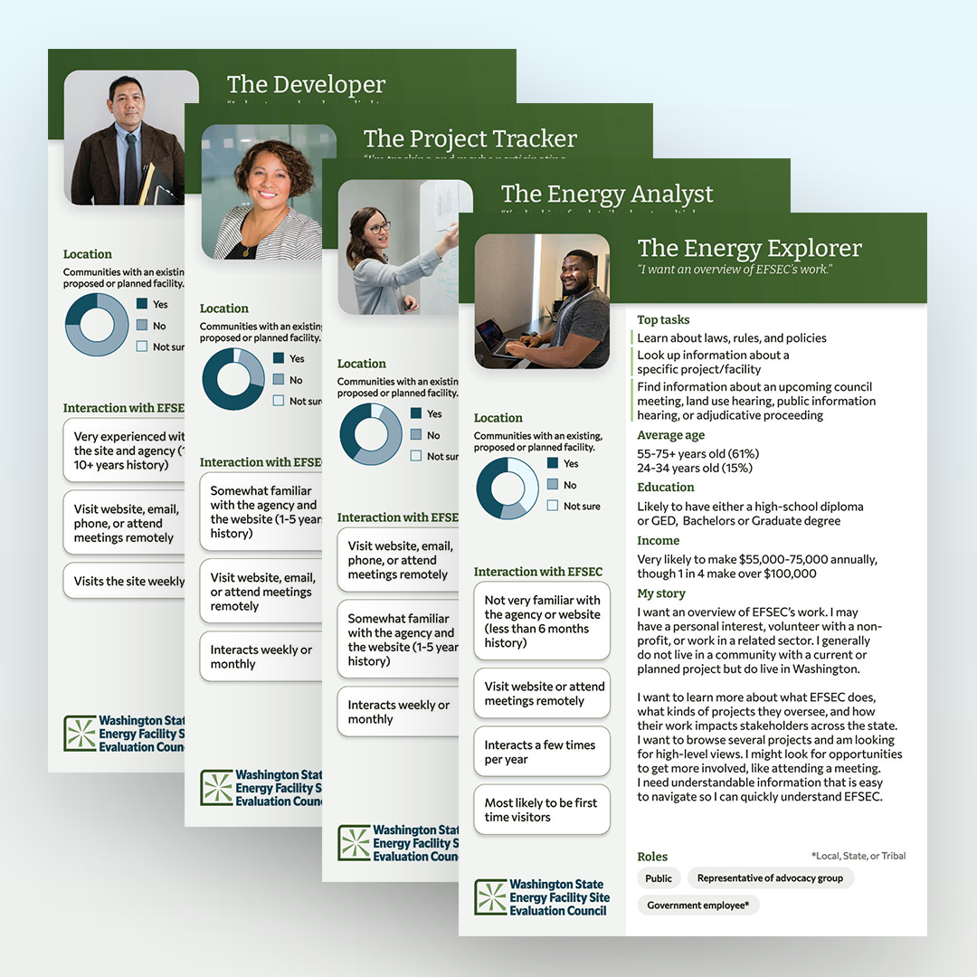
Leaning on surveys launched on the website, stakeholder interviews, conversations with EFSEC's own subject matter experts, and combing public commentary, four distinct user groups emerged that I would need to design for.
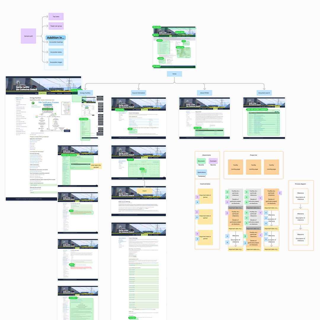
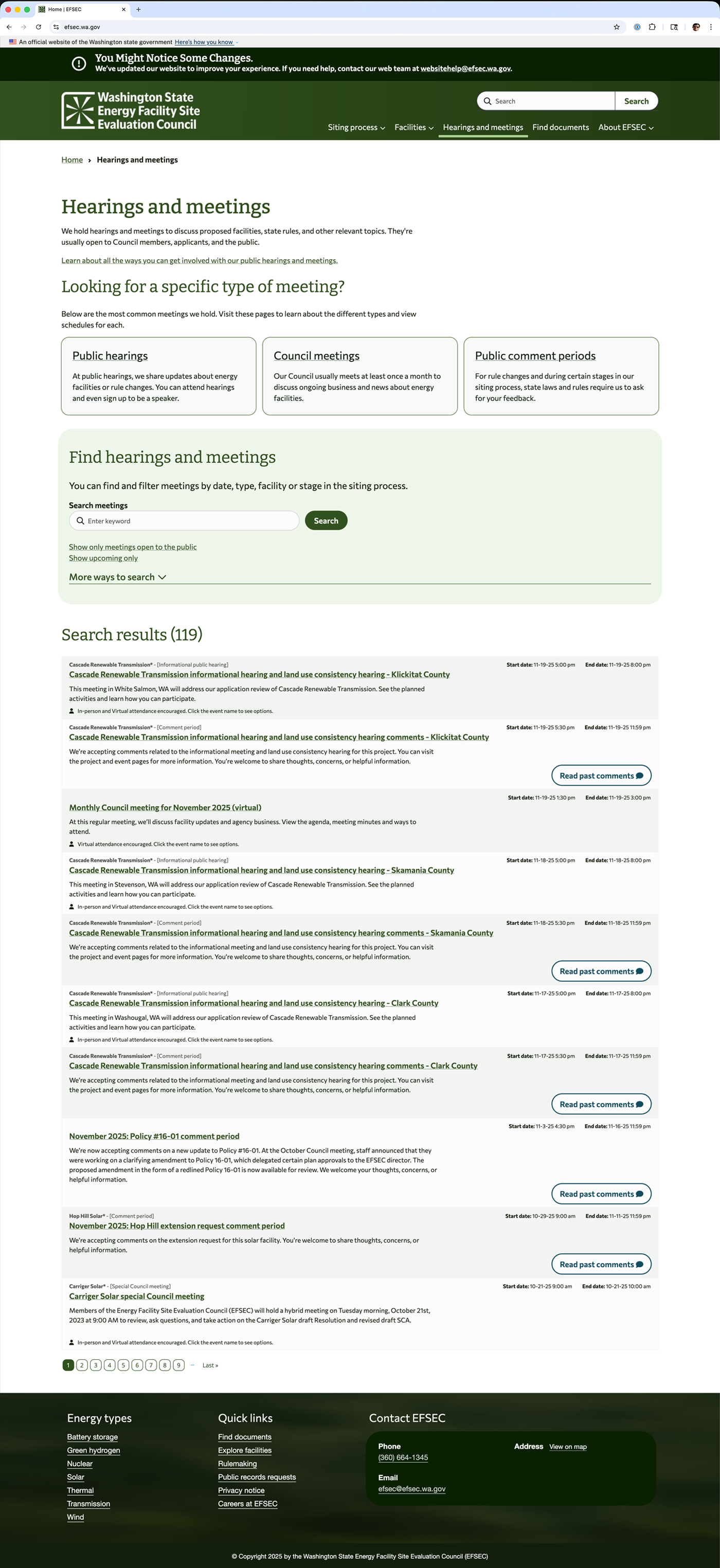
I started with a large scale heuristic evaluation of the site IA, content types, and the various legal processes that were so confusing to users. This evaluation made clear that the way in which the information was presented was a bigger obstacle to users than the quality of information, but some plain language would still go a long way for users.
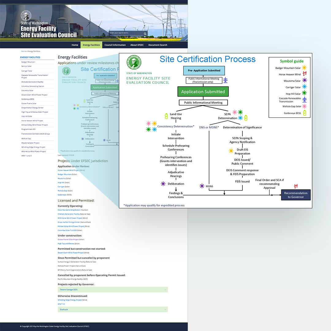
The site was extremely text heavy and relied on out-dated and ineffective ways to communicate which didn't match users mental models or meet their needs.
Based in Seattle, WA